
Alan modelling his new pasty gloves
After eight weeks of painting, wallpapering and sanding, we are down to the Final Two.
Siobhan: maximalist colour addict who loves cherubs, anything sparkly, bonkers wigs, corny signs, and the colour pink.
Lynsey: practical architect who comes up with great storage solutions, has an eye for an upcycled bargain, can do wonders with MDF, and takes a considered approach to how the client will use the space.
Who will win the contract to redesign a space at a luxury Lakes hotel? The nation held it's breath....

For their final challenge, Siobhan and Lynsey were each given a luxury holiday villa near Charlestown in Cornwall. Their brief was to completely makeover the entrance hall, the open plan kitchen/diner/lounge, two bedrooms and a mezzanine landing space. However.....rather than give them both the same design brief (which I think would have been fairer), Lynsey was tasked with turning her villa into a 'Girls Getaway', and Siobhan given the brief of a 'Family Retreat'. If they insisted on giving different briefs then I'm glad it was that way round, as it challenged them both to meet the different needs of the target clients.

The bland canvas requiring interiors magic

Each designer was given three days, £6,000, a selection of carpenters and decorators, and their pick of the eliminated contestants to be their assistant. Siobhan chose Paul (with whom she had struck up a rapport over the weeks), mostly because she had an awful lot of wallpaper to hang and Paul knows his way around a packet of paste and a brush. Lynsey chose Amy - eliminated in week two for her 'amphitheatre in an office' design - and two days later I still can't work out why.

Siobhan and Paul de-beige their villa
Lynsey decided to avoid the girlie cliche of a pink and prosecco scheme, and planned to change her bland villa into a luxurious mix of dark and deep tones of blacks, ink, deep purple, gold and orange. She also planned for a statement wooden block feature on the hall wall, which although looked good did scream 'dust trap' to me. I was also pleased that the villa wouldn't be marketed at families as my son when aged about 8 would have loved nothing better than to have spent the weekend trying to use it as a climbing wall. Amy's use became clear during the making of the wall art - she was given the task of gluing all the blocks in place.....with mixed success.

The wooden wall art/climbing wall
The white kitchen units were painted black, and Lynsey also had the genius idea of adding an island - so that whoever had drawn the short straw of doing the cooking could face out into the room rather than turn their backs on all the fun. Any hen party that had booked some butlers in the buff might have been a little disappointed.

Lynsey's kitchen island
One of Lynsey's signature designs throughout the series has been her use of slatted wooden dividers to create different spaces without blocking off light. She did the same here, separating the kitchen/diner from the lounge whilst simultaneously giving another surface on which to hang the tv (which had otherwise dominated the room). She didn't paint the divider - which I think was a shame as it would have looked fantastic in a gold or copper tone - but otherwise her living room looked gorgeous. I loved the orange sofas and the mulberry coffee table - there was enough knick-knackery to make it interesting, but not so much that it would take two days to clean between lettings, and not too much for a wine-fuelled hen to knock over.

Lynsey's Hall, featuring upcycled sideboard/shoe storage
Upstairs, Lynsey turned the mezzanine area into a glamorous dressing room, with the addition of a few upcycled bargains in a slightly art deco theme. Inside the bedrooms she used pops of the colours downstairs, but with lighter walls and gorgeous fabric headboards. The ugly wardrobe doors were hidden with (surprise, surprise) more wooden slats - each room looked luxurious, but wasn't particularly memorable. Maybe three days wasn't long enough to ensure a wow-factor in each room?

The mezzanine dressing room
Siobhan would have loved the Girls Getaway brief, but instead had to design her villa for a family stay. In true Siobhan style she presumably decided that the family she was designing for was a couple of cool parents with an equally cool teenage daughter, and went in all guns blazing with her usual style.

Siobhan's teal/black/mustard kitchen diner
I loved the teal, mustard and black colour combination she used in the lounge, although was less keen on the black and white hound's tooth and striped wallpapers. She also used large jungle murals, colourful lampshades, and more ornaments and shiny knick knacks than I usually see when I go to a home accessories trade show at the NEC. Certainly any family with small children would take one look at the place and leave their children safely strapped in the car whilst they ran round and hid everything breakable in a lockable cupboard.

Can't think where Siobhan got the idea for her wallpaper...
Out in her hall, Siobhan spent a substantial part of her budget employing a local artist to hand paint a glorious golden mural featuring large birds. Again, the thought of a sticky-fingered child leaving a hand-print on the gold leaf would bring me out in hives, but it was undeniably gorgeous.

Siobhan's hall mural
On the mezzanine, Siobhan finally remembered the 'family' part of her brief, and created a den for kids to escape from their parents. Her bedrooms were - like Lynsey's - very similar to each other, with huge padded headboards and lots of luxury wallpaper. Two double bedrooms doesn't scream 'family escape' to me, but it wasn't made clear whether dumping one of the double beds and replacing it with twins or bunks was allowed (and if it was, then surely Siobhan should have been given a little extra in the budget?).

Siobhan's bedroom
Head Judge Michelle Ogundehin enlisted the help of TWO guest judges for this week's final - clothes and interiors designer Matthew Williamson made his first appearance this series, and Sophie Robinson (who must have something on the production team from her time on the Great Interior Design Challenge) was also invited back to give her verdict.

Matthew & Sophie
All the judges loved Lynsey's transformation, with only slight nit-picking from Michelle about the dark tones used. They praised the kitchen island addition, the slatted wood room divider, the wood art and photography on the walls....although Sophie mentioned that she would have liked a footstool in the lounge. Upstairs they loved the mezzanine dressing area, but were a little disappointed that the bedrooms were quite similar.

Time to judge Lynsey's entrance hall
They loved the new kitchen island....

...but thought the bedrooms lacked the wow factor (and were too similar)
Siobhan's villa was the next for inspection, with the judges wowed by the transformation. They loved each individual piece, but queried on several occasions whether what Siobhan had put together could be said to have fulfilled the 'family retreat' brief - the teenage den aside, there was absolutely nothing that would be described as child-friendly.

Siobhan's entrance hall

Siobhan's family friendly lounge

The 'den' area on the mezzanine

The second double room in Siobhan's villa
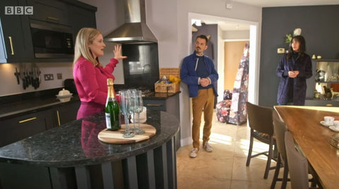
And so to the Sofa of Doom.
It was always going to be difficult for Michelle to choose. She clearly had a soft spot for Siobhan's enthusiasm and feel for colour - particularly as she was the one with no design background (she works as a Communications Manager in the NHS); but Lynsey had undeniably worked to the brief, which is what you are looking for in a professional. Michelle eventually went with her head rather than her heart and picked the designer who could be trusted to listen to the brief and then design for the client rather than for themselves: Lynsey. She gets the job of working on a new scheme for a plush hotel in the Lake District.

The winner!
Lynsey has been my favourite from the beginning, but I've warmed to Siobhan as the series progressed (although still not sure I'd let her loose on my home). To be honest I can see Lynsey making a great success of interior design, and Siobhan and Paul making a success as a design double-act on a minor tv channel.
I've loved this series. I had my doubts about Alan Carr as the presenter, but he's proved me wrong - bringing a light touch to the rather earnest judges, and sticking up for the various designers as they were grilled on the sofa. Roll on series three!
P.S. Lynsey's latest creation turns out not to be a painted piece of slatted wood or an upcycled sideboard from a skip - but baby Poppy, who was born earlier this month. Congratulations again!

Hi Mel,
We enjoyed reading your summaries of the design challenges set on the show. My favourite has to be the beach chalet challenge. We both agree the right person won and have appreciated many of Lynsey’s ideas over the past few weeks. However, I’m afraid we both agreed that Alan Carr was not our cup of tea at the start of the series, although I think Sairah is warming to him! Look forward to the next series